Nobek Asesores Legales
Establishing Credibility for a Modern Corporate Law Firm
🔎 TL;DR: A full brand system for a new corporate law firm in Ecuador, from naming to web. I led strategy, naming, and visual identity, and extended the system across digital and print touchpoints to help the firm compete in a saturated legal market.
Services
Services
Services
Services
Naming · Brand Identity · Website · Print Collateral · Social · Email
Role
Role
Role
Role
Brand Designer

About the Project
In 2019, three senior partners launched Nobek Asesores Legales, a corporate law firm based in Quito. They needed a professional identity that could stand alongside long-established firms — something trustworthy, contemporary, and differentiated.
The name “Nobek” came from a fusion of the partners’ last names, Noboa and Benalcázar, symbolizing unity and shared leadership. I led the full branding process, collaborating with designer Paula Loyola as part of our freelance studio.
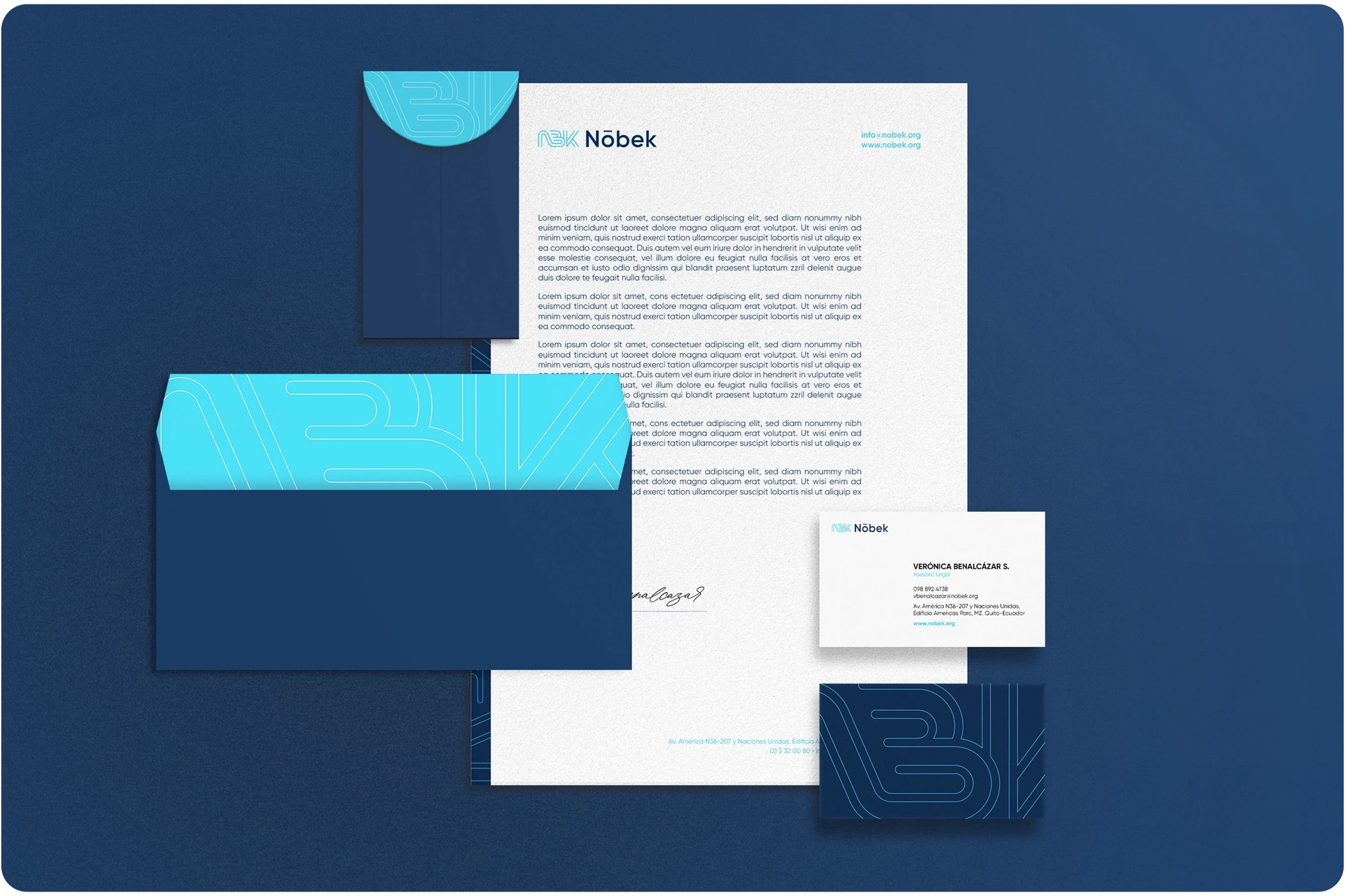
We built a clean, modern identity centered on clarity and trust, including:
A bold typographic logo
A modern serif and sans-serif type system
A professional color palette of navy, teal, and gray
Collateral across all brand touchpoints, from stationery to digital templates
As the firm grew, we expanded into digital: website design on Squarespace, social content, branded presentations, email campaigns, and art direction for their team photography.
The Challenge
The legal landscape in Ecuador is crowded with traditional, legacy-driven brands. Nobek’s partners were highly experienced, but as a new firm, their brand needed to establish instant credibility and communicate a clear point of view.
We needed to:
Build a brand identity entirely from scratch, beginning with naming
Balance a modern aesthetic with corporate expectations
Create a scalable system that works across print, digital, and internal communications
Craft a voice and visual presence that felt personal, expert, and accessible
This project required ta houghtful strategy to ensure the brand projected confidence without losing approachability — a key differentiator in a saturated legal market.
Results & Impact
Nobek launched with a strong, cohesive identity and quickly built a reputation in the corporate space. Clients and peers responded positively to the clarity and modernity of the brand, and the system remains in use today.
🎯 Takeaways from this project
Full-system branding, from naming to web, builds alignment and credibility from day one
Even in traditional sectors, clarity and simplicity can differentiate meaningfully
Establishing a scalable identity early allows a new firm to grow with consistency
This project sparked my passion for brand strategy and led me to pursue my master’s degree in branding and visual identity
About the Project
In 2019, three senior partners launched Nobek Asesores Legales, a corporate law firm based in Quito. They needed a professional identity that could stand alongside long-established firms — something trustworthy, contemporary, and differentiated.
The name “Nobek” came from a fusion of the partners’ last names, Noboa and Benalcázar, symbolizing unity and shared leadership. I led the full branding process, collaborating with designer Paula Loyola as part of our freelance studio.
We built a clean, modern identity centered on clarity and trust, including:
A bold typographic logo
A modern serif and sans-serif type system
A professional color palette of navy, teal, and gray
Collateral across all brand touchpoints, from stationery to digital templates
As the firm grew, we expanded into digital: website design on Squarespace, social content, branded presentations, email campaigns, and art direction for their team photography.
The Challenge
The legal landscape in Ecuador is crowded with traditional, legacy-driven brands. Nobek’s partners were highly experienced, but as a new firm, their brand needed to establish instant credibility and communicate a clear point of view.
We needed to:
Build a brand identity entirely from scratch, beginning with naming
Balance a modern aesthetic with corporate expectations
Create a scalable system that works across print, digital, and internal communications
Craft a voice and visual presence that felt personal, expert, and accessible
This project required ta houghtful strategy to ensure the brand projected confidence without losing approachability — a key differentiator in a saturated legal market.
Results & Impact
Nobek launched with a strong, cohesive identity and quickly built a reputation in the corporate space. Clients and peers responded positively to the clarity and modernity of the brand, and the system remains in use today.
🎯 Takeaways from this project
Full-system branding, from naming to web, builds alignment and credibility from day one
Even in traditional sectors, clarity and simplicity can differentiate meaningfully
Establishing a scalable identity early allows a new firm to grow with consistency
This project sparked my passion for brand strategy and led me to pursue my master’s degree in branding and visual identity


