Noetic Creative
Repositioning a B2B Agency with a Brand-Led Website Redesign
🔎 TL;DR: A full brand and website overhaul to help Noetic attract and close higher-value B2B clients. I led the visual identity refresh, redesigned the website in Figma, and rebuilt it in Elementor, grounding every decision in strategy, audience insights, and narrative clarity.
Services
Services
Services
Services
Brand Strategy · Visual Identity · Web Design · WordPress Implementation
Role
Role
Role
Role
Lead Designer
About the Project
Noetic Creative is a U.S.-based agency that primarily works with B2B clients across education, healthtech, and innovation. As the company expanded beyond performance marketing into creative services, its brand and website no longer reflected its capabilities or credibility.
Although I was initially tasked internally with redesigning the website, I recognized that the existing brand lacked the strategic foundation needed for an effective rebuild. I recommended that we first revisit the brand strategy and refresh the visual identity before moving into UI. The founder agreed, and this approach ultimately created a more cohesive identity, elevated the agency’s message, and strengthened trust with enterprise-level clients.
The Challenge
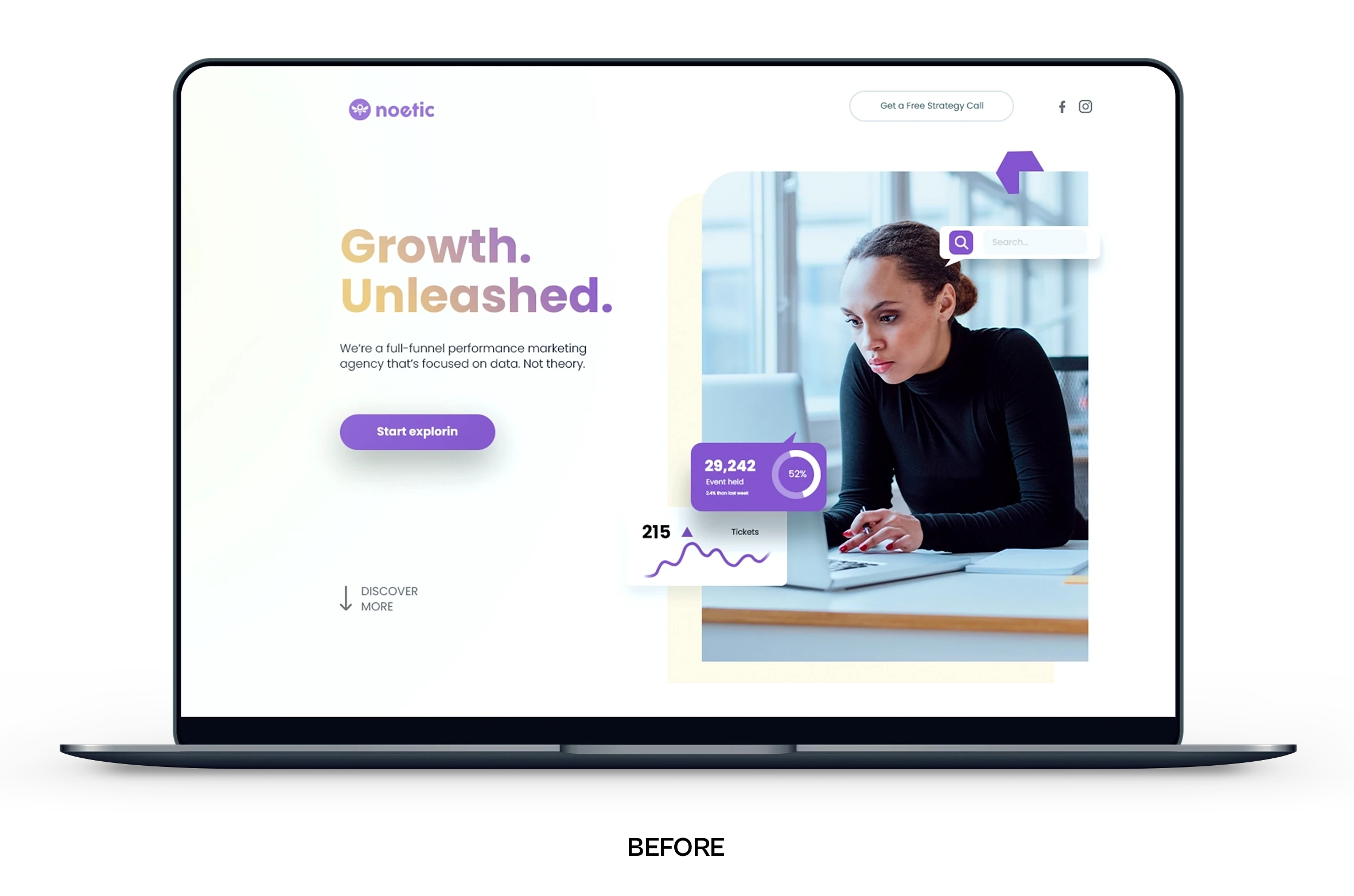
As we prepared to rebuild the website, it became clear how quickly the existing brand identity and site had been assembled as the agency grew. The visual system felt generic and inconsistent, and it didn’t reflect Noetic’s expanded capabilities or the level of work the team was doing for B2B clients.
Without a clear narrative, strategic foundation, or cohesive visual language, the website couldn’t communicate Noetic’s value or support sales conversations. Before we could design a site that truly represented the agency, we needed to strengthen the brand at its core.
To do that, I led a foundational brand strategy and creative direction phase, which included:
Defining voice, values, and differentiators using a brand key
Building buyer personas and clarifying primary and secondary audiences
Using brand archetypes to shape tone and visual personality
Auditing competitors and developing a focused creative direction
Partnering closely with our strategist and copywriter to align story and visuals
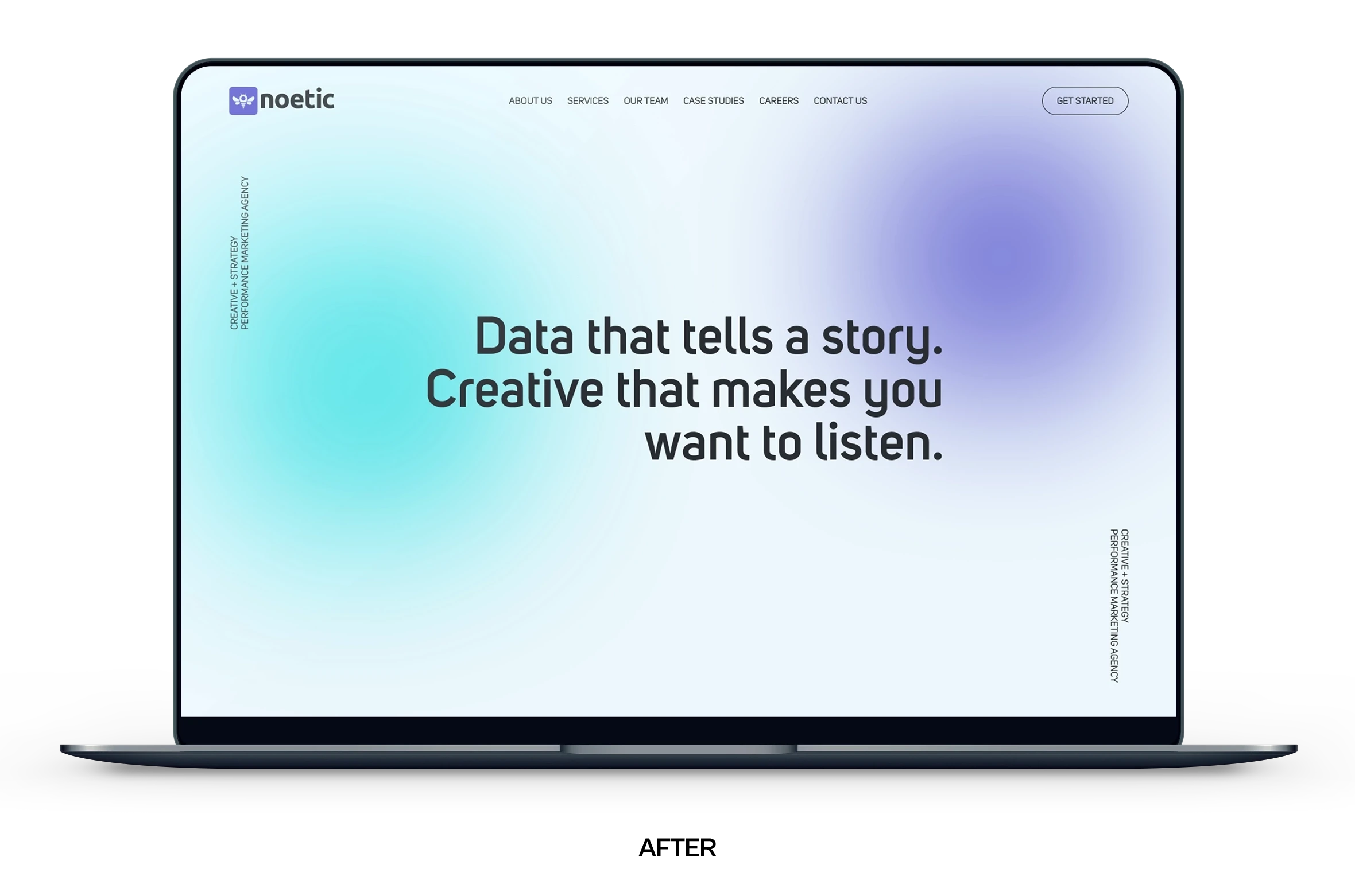
The resulting identity and website were built as a modular, scalable system that clarified the brand, reflected its growth, and established a more credible presence for enterprise-level clients.
Results & Impact
The refreshed brand and website launched in early 2023 and quickly became a core asset in Noetic’s sales and onboarding process. With a clearer narrative and more cohesive visual identity, the agency could present its capabilities with greater confidence and consistency.
The new system:
Strengthened trust with enterprise-level prospects by elevating the overall brand presence
Helped the founder lead more compelling sales conversations grounded in clarity and alignment
Improved usability, hierarchy, and storytelling across the website, making complex services easier to understand
Provided a scalable visual and UI framework that supported new offerings as the agency continued to grow
🎯 Takeaways from this project:
Strategy-first design creates stronger, more durable outcomes
A unified identity strengthens communication across every touchpoint
Designers lead best by providing clarity, rationale, and direction through ambiguity
About the Project
Noetic Creative is a U.S.-based agency that primarily works with B2B clients across education, healthtech, and innovation. As the company expanded beyond performance marketing into creative services, its brand and website no longer reflected its capabilities or credibility.
Although I was initially tasked internally with redesigning the website, I recognized that the existing brand lacked the strategic foundation needed for an effective rebuild. I recommended that we first revisit the brand strategy and refresh the visual identity before moving into UI. The founder agreed, and this approach ultimately created a more cohesive identity, elevated the agency’s message, and strengthened trust with enterprise-level clients.
The Challenge
As we prepared to rebuild the website, it became clear how quickly the existing brand identity and site had been assembled as the agency grew. The visual system felt generic and inconsistent, and it didn’t reflect Noetic’s expanded capabilities or the level of work the team was doing for B2B clients.
Without a clear narrative, strategic foundation, or cohesive visual language, the website couldn’t communicate Noetic’s value or support sales conversations. Before we could design a site that truly represented the agency, we needed to strengthen the brand at its core.
To do that, I led a foundational brand strategy and creative direction phase, which included:
Defining voice, values, and differentiators using a brand key
Building buyer personas and clarifying primary and secondary audiences
Using brand archetypes to shape tone and visual personality
Auditing competitors and developing a focused creative direction
Partnering closely with our strategist and copywriter to align story and visuals
The resulting identity and website were built as a modular, scalable system that clarified the brand, reflected its growth, and established a more credible presence for enterprise-level clients.
Results & Impact
The refreshed brand and website launched in early 2023 and quickly became a core asset in Noetic’s sales and onboarding process. With a clearer narrative and more cohesive visual identity, the agency could present its capabilities with greater confidence and consistency.
The new system:
Strengthened trust with enterprise-level prospects by elevating the overall brand presence
Helped the founder lead more compelling sales conversations grounded in clarity and alignment
Improved usability, hierarchy, and storytelling across the website, making complex services easier to understand
Provided a scalable visual and UI framework that supported new offerings as the agency continued to grow
🎯 Takeaways from this project:
Strategy-first design creates stronger, more durable outcomes
A unified identity strengthens communication across every touchpoint
Designers lead best by providing clarity, rationale, and direction through ambiguity


