El Cevichón Restaurant
Blending Coast and Highlands in a Restaurant Rebrand with Personality
🔎 TL;DR: A full rebrand for El Cevichón as they expanded beyond seafood. I co-led the redesign from logo to menu and food photography, creating a bold, culturally rooted identity that unified every touchpoint.
Services
Services
Services
Services
Branding · Visual Identity · Photography · Social Media
Role
Role
Role
Role
Brand Designer

About the Project
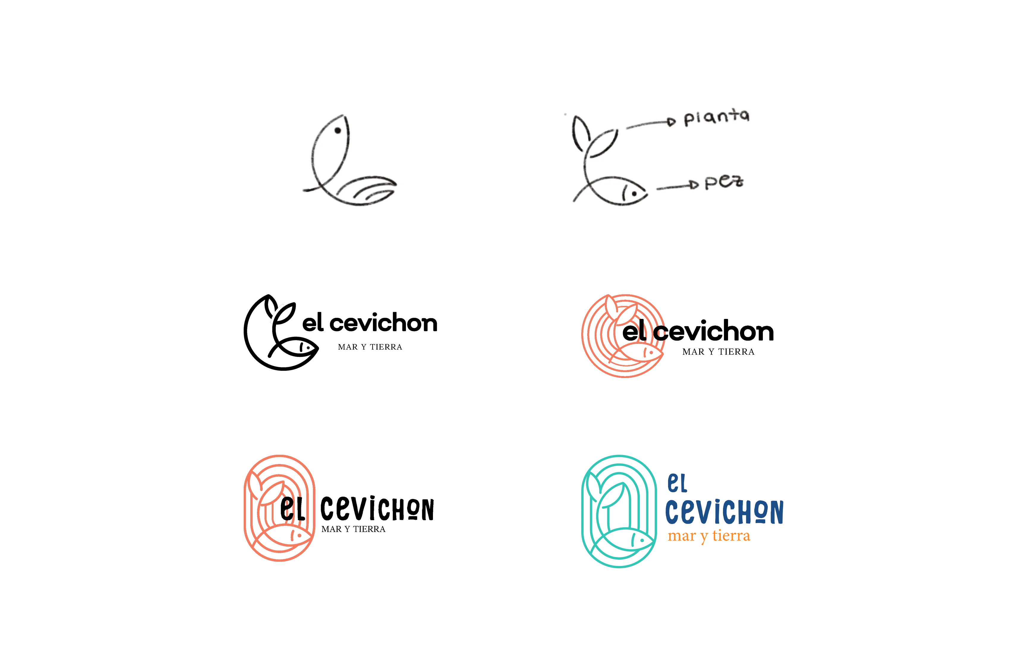
El Cevichón began as a coastal Ecuadorian seafood spot, but when they expanded their menu to include traditional highland dishes, their DIY logo and brand no longer matched the richness of the experience. The new identity needed to express the fusion of coast and sierra while feeling modern, playful, and unmistakably Ecuadorian.
The Challenge
The restaurant had a loyal customer base, so the rebrand needed to introduce a fresher, more unified identity without losing the spirit people connected with. The brand also had to flex across a wide range of touchpoints — menus, signage, packaging, social content, and delivery platforms — all of which needed clear hierarchy and consistency.
I co-led the rebrand with designer Paula Loyola. Together, we:
Developed the concept and visual direction
Designed the logo, color system, type palette, patterns, and brand voice
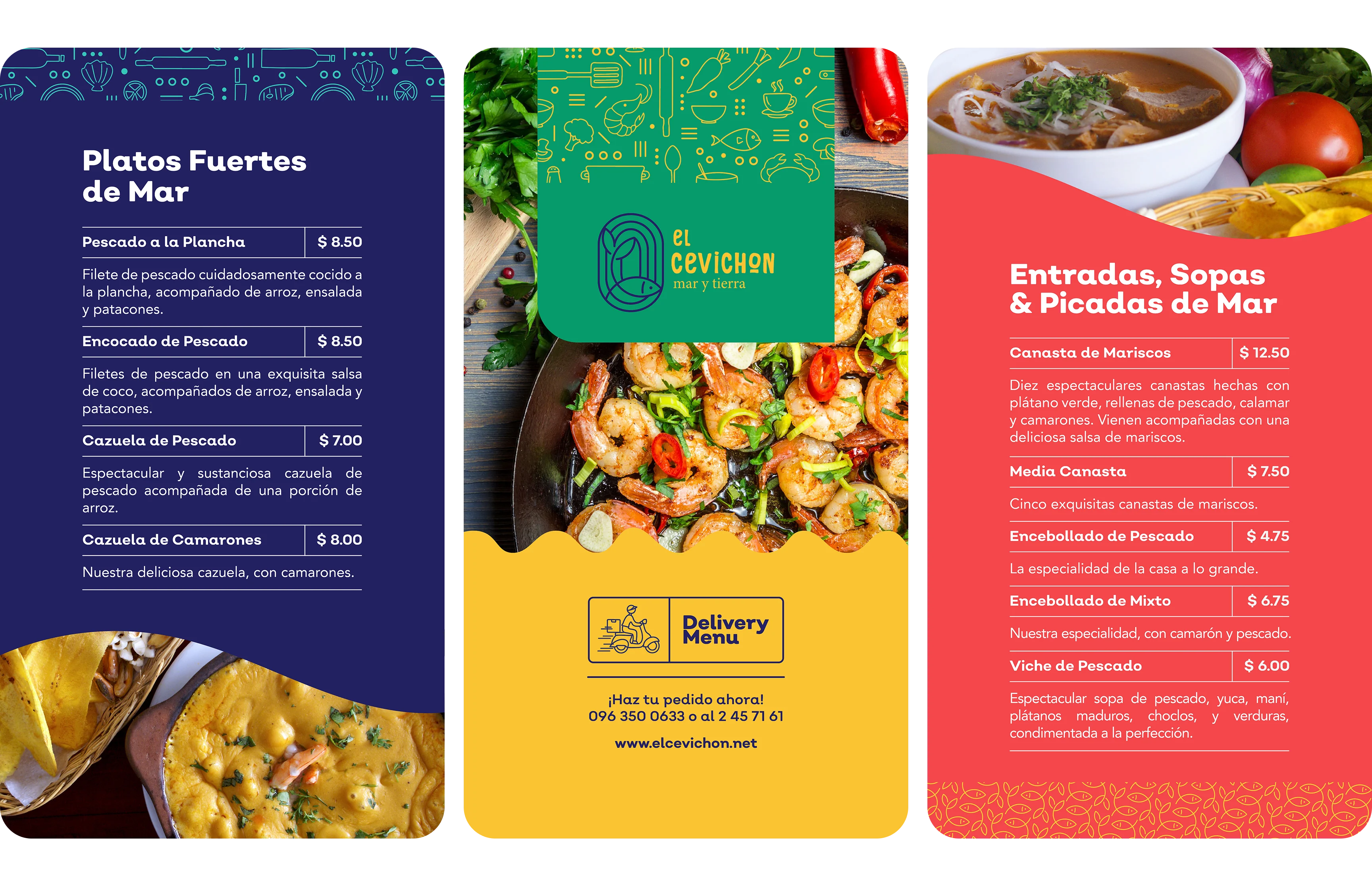
Shot and edited product photography for menus, marketing, and social media ads and posts
Built restaurant collateral, including QR menus, highlight menus, and signage
Created social templates and partnered with the client to support marketing during lockdowns
To ground the identity, we pulled visual cues from both the coast and the highlands: textures, patterns, crafts, and iconic ingredients. We also observed how small restaurants were adapting during COVID, which informed our mobile-first approach and QR menu system.
Results & Takeaways
The client and regulars warmly received the rebrand. It gave the restaurant a cohesive, confident identity that felt rooted in place and culture, and improved consistency across both digital and in-person experiences.
📸 For me, this project strengthened my ability to:
Build a system that balances cultural storytelling with a clear visual hierarchy
Adapt strategic thinking to a small-business context with real constraints
Lead product photography and integrate it into a broader visual system
Problem-solve creatively around pandemic limitations and shifting customer behavior
This project was meaningful on a personal level and deepened my understanding of how brand identity can connect people to community, culture, and shared experience.
About the Project
El Cevichón began as a coastal Ecuadorian seafood spot, but when they expanded their menu to include traditional highland dishes, their DIY logo and brand no longer matched the richness of the experience. The new identity needed to express the fusion of coast and sierra while feeling modern, playful, and unmistakably Ecuadorian.
The Challenge
The restaurant had a loyal customer base, so the rebrand needed to introduce a fresher, more unified identity without losing the spirit people connected with. The brand also had to flex across a wide range of touchpoints — menus, signage, packaging, social content, and delivery platforms — all of which needed clear hierarchy and consistency.
I co-led the rebrand with designer Paula Loyola. Together, we:
Developed the concept and visual direction
Designed the logo, color system, type palette, patterns, and brand voice
Shot and edited product photography for menus, marketing, and social media ads and posts
Built restaurant collateral, including QR menus, highlight menus, and signage
Created social templates and partnered with the client to support marketing during lockdowns
To ground the identity, we pulled visual cues from both the coast and the highlands: textures, patterns, crafts, and iconic ingredients. We also observed how small restaurants were adapting during COVID, which informed our mobile-first approach and QR menu system.
Results & Takeaways
The client and regulars warmly received the rebrand. It gave the restaurant a cohesive, confident identity that felt rooted in place and culture, and improved consistency across both digital and in-person experiences.
📸 For me, this project strengthened my ability to:
Build a system that balances cultural storytelling with a clear visual hierarchy
Adapt strategic thinking to a small-business context with real constraints
Lead product photography and integrate it into a broader visual system
Problem-solve creatively around pandemic limitations and shifting customer behavior
This project was meaningful on a personal level and deepened my understanding of how brand identity can connect people to community, culture, and shared experience.


